seaborn
Matplotlib을 기반으로 한 고수준 시각화 라이브러리2D 그래프 시각화 라이브러리
분포 그래프
• sns.histplot() → 히스토그램 / KDE 그래프
• sns.kdeplot() → 커널 밀도 추정 그래프
• sns.distplot() → (구버전, histplot으로 대체됨)
관계 그래프
• sns.scatterplot() → 두 변수 간 관계 산점도
• sns.lineplot() → 선 그래프
• sns.regplot() → 회귀선 포함 산점도
카테고리형
• sns.barplot() → 평균 막대 그래프 (통계 기반)
• sns.countplot() → 빈도 막대 그래프
• sns.boxplot() → 박스 플롯
• sns.violinplot() → 바이올린 플롯 (분포 + 밀도)
• sns.stripplot() → 점 그래프
다변량
• sns.pairplot() → 여러 변수의 관계 행렬 그래프
• sns.heatmap() → 상관관계, 행렬 데이터 시각화
스타일
• sns.set_style() → 그래프 스타일 지정 (white, darkgrid 등)
• sns.color_palette() → 색상 팔레트 설정
# 산점도

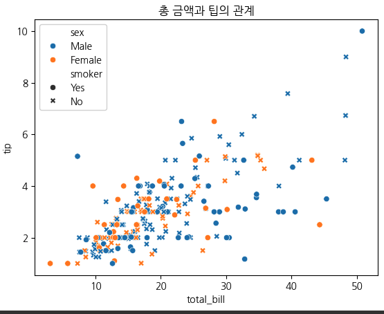
df = sns.load_dataset('tips')
sns.scatterplot(data=df, x='total_bill', y='tip', hue ='sex', style= 'smoker')
plt.title('총 금액과 팁의 관계')
plt.show()

'''
data=df : DataFrame 전체를 넘김
x, y : 각각 x축, y축 컬럼명
hue='sex’ : 성별에 따라 색상 구분
style='smoker’ : 흡연 여부에 따라 마커 모양 구분'''
# 히트맵

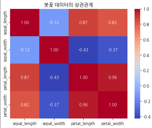
df = sns.load_dataset('iris')  # 붓꽃 데이터
# 상관계수 계산
corr = df.corr(numeric_only=True)
# 히트맵
sns.heatmap(corr, annot=True, cmap='coolwarm', fmt=".2f")
plt.title('붓꽃 데이터의 상관관계')
plt.show()

'''
annot=True: 각 칸에 수치 표시
cmap='coolwarm': 색상 맵 설정
fmt=".2f": 소수점 둘째 자리까지 표시'''
(히트맵) — cmap= 에 들어갈 옵션

Sequential (연속형)
예시: 'viridis', 'plasma', 'inferno', 'magma', 'cividis', 'Blues', 'Greens', 'OrRd'
설명: 낮은 값 → 밝은색, 높은 값 → 진한색
용도: 값의 크기(온도, 점수 등)

Diverging (양/음 대비)
예시: 'coolwarm', 'bwr', 'seismic', 'RdBu', 'PiYG', 'PRGn', 'RdYlBu'
설명: 중심(0)을 기준으로 양/음 구분
용도: 상관계수, 편차, 잔차

Categorical (범주형)
예시: 'tab10', 'tab20', 'Set1', 'Set2', 'Paired'
설명: 명확히 구분되는 색상들
용도: 그룹, 범주 비교

Cyclic (순환형)
예시: 'twilight', 'hsv', 'twilight_shifted'
설명: 색이 순환 구조를 가짐
용도: 각도, 위상 등 주기 데이터

Miscellaneous (기타)
예시: 'cubehelix', 'gnuplot', 'rainbow'
설명: 다양한 실험용 팔레트
용도: 임의의 시각 효과
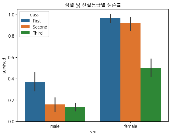
# 카테고리형 데이터

df = sns.load_dataset('titanic')
# 성별에 따른 생존률 평균
sns.barplot(data=df, x='sex', y='survived', hue='class')
plt.title('성별 및 선실등급별 생존률')
plt.show()

'''
y='survived' → 평균 생존률 자동 계산
hue='class' → 1등석, 2등석, 3등석 색상 구분'''
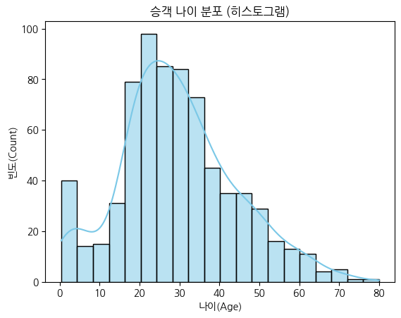
# 히스토그램

df = sns.load_dataset('titanic')
# 히스토그램 그리기
sns.histplot(data=df, x='age', bins=20, kde=True, color='skyblue')
plt.title('승객 나이 분포 (히스토그램)')
plt.xlabel('나이(Age)')
plt.ylabel('빈도(Count)')
plt.show()

'''
x='age' → X축에 나이 데이터
bins=20 → 막대를 20개 구간으로 나눔
kde=True → 커널 밀도곡선(Kernel Density Estimation)을 함께 표시 (부드러운 곡선)
color='skyblue' → 막대 색상 설정''
# boxplot

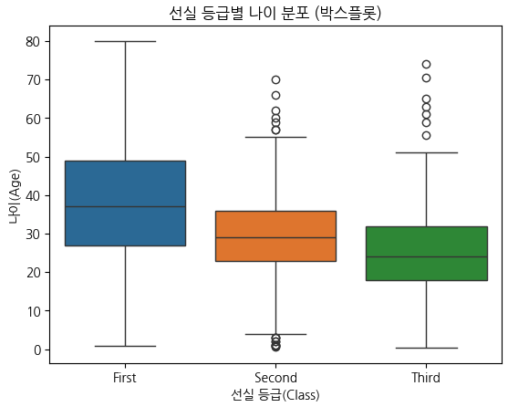
sns.boxplot(data=df, x='class', y="age", hue='class')
plt.title('선실 등급별 나이 분포 (박스플롯)')
plt.xlabel('선실 등급(Class)')
plt.ylabel('나이(Age)')
plt.show()

x='class' → 그룹 구분 기준 (1등석, 2등석, 3등석)
y='age' → 각 그룹의 나이 데이터

'''
• 중앙선 (box 안의 선) → 중앙값 (median)
• 박스 하단/상단 → 1사분위수(Q1), 3사분위수(Q3)# Q1: 25%, Q2: 50%, Q3: 75%
• 박스 높이 → IQR (Interquartile Range = Q3 - Q1) # 전체의 50%
• 수염(whisker) → 박스 외곽(Q1, Q3)에서 ±1.5×IQR 범위
• 점(○) → 이상치(outlier)'''
# Violin plot

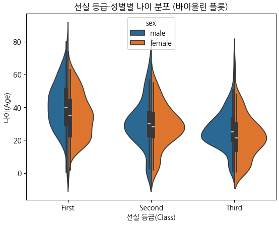
sns.violinplot(data=df, x='class', y='age', hue='sex', split=True)
plt.title('선실 등급·성별별 나이 분포 (바이올린 플롯)')
plt.xlabel('선실 등급(Class)')
plt.ylabel('나이(Age)')
plt.show()

'''
x='class', y='age' → 등급별 나이 분포
hue='sex' → 성별에 따라 색상 구분
split=True → 같은 x위치에 남녀 분포를 좌우로 나눠 표시

박스플롯 + 분포(밀도)” 결합형
폭이 넓을수록 → 해당 나이대 인원이 많다는 뜻
폭이 좁을수록 → 그 구간의 데이터가 적음
중앙의 흰 점 → 중앙값 (median)
검은 막대 → IQR 범위'''
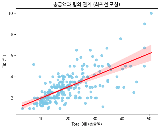
# 회귀선(regression line)

df = sns.load_dataset('tips')
# 총금액과 팁의 관계 시각화
sns.regplot(data=df, x='total_bill', y='tip', color='skyblue',
line_kws={'color':'red'})
plt.title('총금액과 팁의 관계 (회귀선 포함)')
plt.xlabel('Total Bill (총금액)')
plt.ylabel('Tip (팁)')
plt.show()

'''
파란 점: 각 손님(샘플)의 total_bill 과 tip
빨간 선: 두 변수 간의 최적의 회귀선(직선 관계)
즉, tip ≈ a × total_bill + b 형태
이 선의 기울기가 양수면 → “금액이 클수록 팁도 많다”는 의미'''
스타일 설정 및 요약
sns.set_style("darkgrid")   # 배경 그리드 스타일
sns.set_palette("pastel")   # 색상 팔레트 지정

스타일 옵션: "white", "dark", "whitegrid", "darkgrid", "ticks"

항목별 요약
• 기반 → Matplotlib 기반
• 장점 → 데이터프레임 직접 입력, 통계적 그래프 제공
• 자주 쓰는 함수 → scatterplot, barplot, heatmap, pairplot
• 시각화 대상 → 수치형, 범주형, 통계적 관계 모두 가능
• 추천 데이터셋 → tips, iris, titanic, penguins
``````python
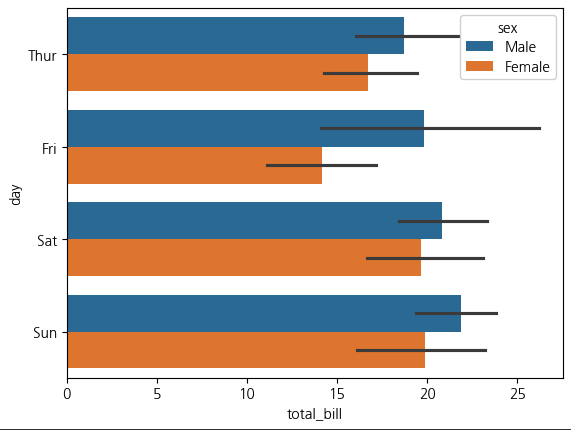
tips= sns.load_dataset('tips')
sns.barplot(x='total_bill',y='day',hue='sex',data=tips)
plt.show()
sns.set_context('notebook')
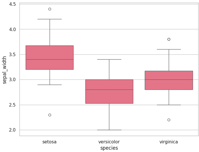
iris = sns.load_dataset('iris')

plt.figure(figsize=(8,6))
sns.boxplot(x= 'species', y='sepal_width', data=iris)
plt.show()
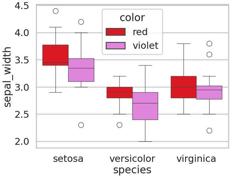
color = ['red', 'violet']
iris['color'] = [color[x] for x in np.random.randint(0, 2, 150)]

plt.figure(figsize=(8,6))
sns.boxplot(x='species', y='sepal_width', hue='color', data=iris, palette={'red':'red', 'violet':'violet'})
plt.show()
plt.figure(figsize=(8,6))
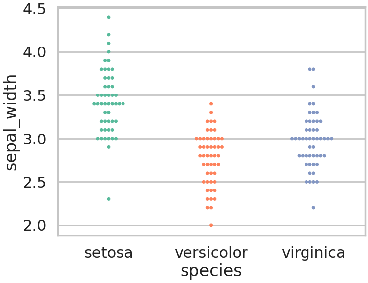
sns.swarmplot(x='species', y='sepal_width',hue = 'species',data=iris, palette='Set2')
plt.show()
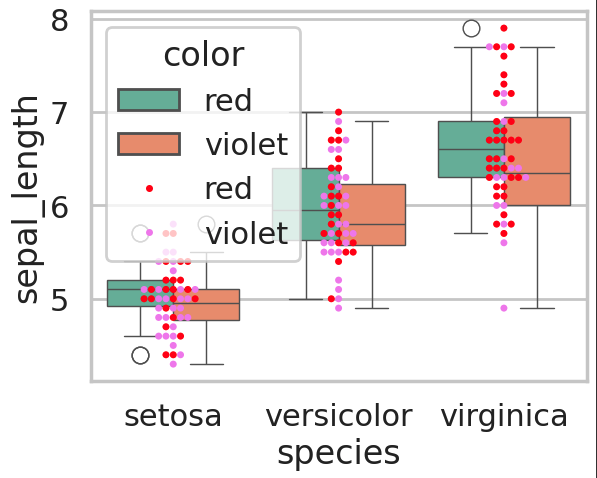
sns.boxplot(x='species', y="sepal_length", data=iris, hue="color", palette="Set2")
sns.swarmplot(x='species', y="sepal_length", data=iris, hue="color", palette={'red':'red', 'violet':'violet'})
plt.show()
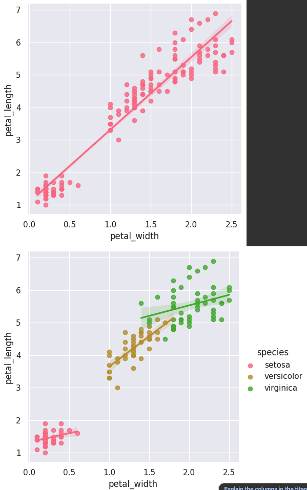
sns.set_style("darkgrid")
sns.lmplot(x="petal_width", y="petal_length", data=iris)
sns.lmplot(x="petal_width", y="petal_length", data=iris, hue = 'species')
plt.show()
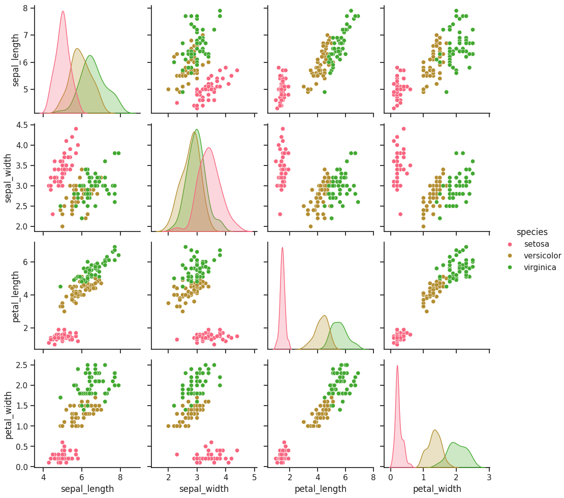
sns.set_style("ticks")
sns.set_context("notebook")

sns.pairplot(iris, hue="species")
plt.show()
sns.set_style("ticks")
sns.set_context("notebook")

sns.pairplot(iris, x_vars=['sepal_width', 'sepal_length'], y_vars=["petal_width", "petal_length"],hue="species")

plt.show()
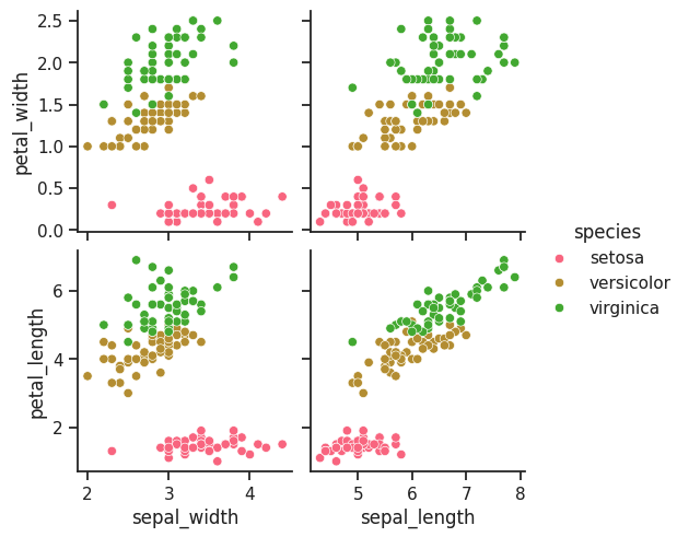
plt.figure(figsize=(7,6))
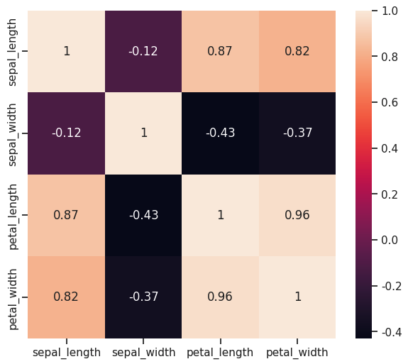
sns.heatmap(iris.iloc[:, 0:4].corr(),annot=True,)
plt.show()
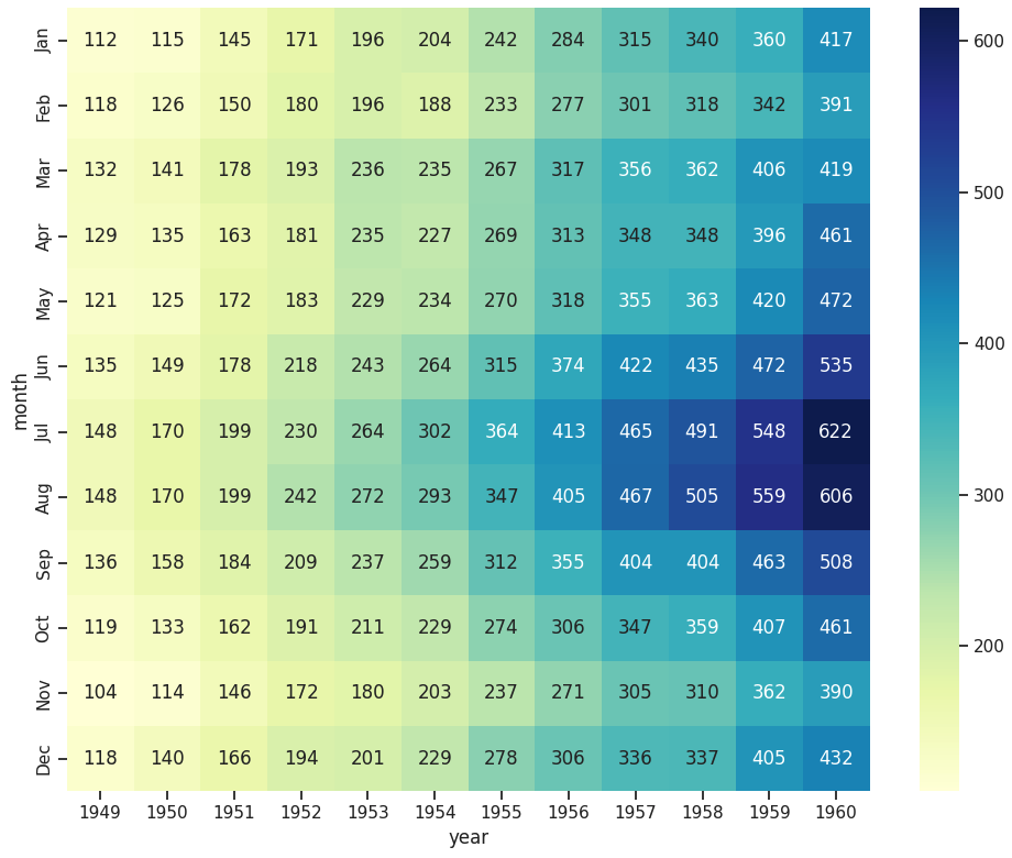
plt.figure(figsize=(10,8))
flights = sns.load_dataset("flights")
f = flights.pivot(index="month", columns="year", values="passengers")

sns.heatmap(f,annot=True,fmt='d', cmap='YlGnBu')
plt.tight_layout()
plt.show()